
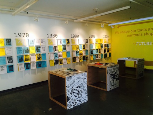
The centerpiece of the student-produced show was an interactive typographical timeline enabling viewers to create a customizable program. Photo by Nik Hafermaas
The passageway leading into the South Campus gallery is swimming in an alphabet soup of letters and familiar icons and signage, hawking everything from the latest blockbuster to cheap, fast cash loans. It’s an immersive experience in the nuanced codes and messages contained within the various fonts and typefaces that punctuate our modern landscape. This visceral typographic encounter acts as an introduction to the student-produced temporary show, 85_15 TYPOGRAPHY: PAST/PRESENT/FUTURE, which is the first exhibition to be presented by the new Hoffmitz Milken Center for Typography (HMCT), due to make its official debut on November 7 with the Symposium and Center opening celebration in its permanent space on the ground floor of ArtCenter’s 950 South Raymond building.


 Today marks 100 years since the founding of the