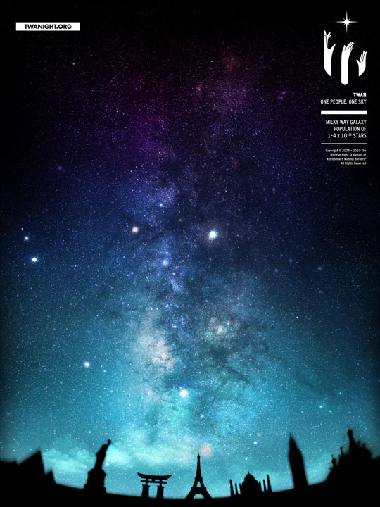
Open issue 49 of CMYK Magazine (due on newsstands this month) and you’ll find the work of recent John Marshall High School graduate and Saturday High student Richard Kam.
A logo and poster Richard created for the nonprofit The World at Night was selected for inclusion in the magazine by Connie Hwang of San Francisco’s Connie Hwang Design. The logo and poster were part of a rebranding assignment in Zohrab “Z” Gevorkian’s Graphic Design Saturday High course last spring. Gevorkian was so impressed by Richard’s work that he encouraged him to submit his work to CMYK, a magazine that features work by emerging college art students.
“I felt Richard’s work was at a place that was deserving to be competitive,” explains Gevorkian. “Yes, he was a high school student, but it is a college course. He was hesitant at first, but Richard ended up submitting his work, and he was selected. He really broke the mold.”
We recently caught up with Kam to chat about the honor.
Dotted Line: Tell us a little about the work that CMYK selected.
Richard Kam: They’re printing a logo and a poster I designed for The World a Night (TWAN), an offshoot of Astronomers Without Borders. TWAN is a photography group whose slogan is “One people, one sky,” and its members, who come from all around the world, upload and share beautiful nighttime and space photography. They also organize an annual exhibition. Their basic philosophy is that regardless of which country you’re from, the night sky is for all of us to share.
Dotted Line: Why did you choose TWAN?
Kam: I really like astronomy and space exploration. It’s a whole new frontier and it’s so vast. And I really like what TWAN is doing, so I wanted to bring some new light to them.
Dotted Line: Is TWAN aware of your redesign?
Kam: A few weeks before CMYK contacted me, I gathered together all my files, and I wrote TWAN a really long email. I started with, “If you’re really busy right now, please don’t read this. Open it at a later time. And please forward this to somebody who’s in a position to read this.” The rest of the letter was the creative brief I wrote for the project in class. I ended by asking them to just look at a fan’s work and see what they think.
Dotted Line: Did you hear back from them?
Richard Kam: About a week later they emailed me back and said they really liked my work. They said they’re not looking for a redesign right now, but said I should call them in the future if I’m interested in helping them out. That was really nice.
Dotted Line: How did Saturday High change your perception of design?
Kam: When I first started at Art Center, I thought design was just making something look perfect. But my instructor, Z, introduced principles I wasn’t aware of. The first day of class, he gave us three shapes–a triangle, a circle and a square–and told us to create a balanced space. That was hard; I was used to just pushing pixels around. Z told us that pre-planning and conceptualization are what lead to strong design. He also gave us a design process with eight steps and assured us that if we follow these steps, our designs will turn out great.
Dotted Line: Did any of those steps take you by surprise?
Kam: There’s one that Z calls “barfing,” where you just let all your ideas flow. You just keep writing, and once you’re done, you stop, take a break, anything to take your mind off it. In design, it’s easy to get worked up over the small things when there’s so much else to do.
Dotted Line: So, what’s next?
Kam: I just graduated from high school a few months ago. Right now, I’m doing website design for a company based in San Diego. And I’m applying to colleges. I have a number of options I’m considering.
Dotted Line: Anything else you wanted to share?
Kam: Don’t underestimate high school kids. In astronomical terms, high school kids are like sixth magnitude stars. Sixth magnitude stars might actually be really bright–brighter than our own star even–but they’re really far away, so you wouldn’t know at first glance. Just give them a chance.


