Katherine Bennett teaches advanced research in graduate and undergraduate industrial design at Art Center College of Design, where she pioneered the integration of professional-level design research into the product design curriculum. The following article was originally published in the current issue of the Industrial Design Society of America’s journal, Innovation.
Stepping beyond problem finding to problem framing and the need to eliminate bias on the part of designers and clients—these are big topics in the world of research. But are they in industry? While techniques on their own won’t eliminate bias and properly frame the problem, it is necessary to address these issues.
Validating vs. Generating Hypotheses
In my advanced design research classes, we discuss eliminating bias; students are rightly concerned. In industry, however, we see many examples of what I call “research in name only:” research done to prove a previously conceived idea or to bolster someone’s hunch, research done not to find the truth about consumers, but to confirm preexisting ideas. This is useful if you’re validating a concept midway through a design process that starts with good up-front research, is unbiased and is looking to understand customer needs. But we see enough examples of research done for the sake of saying one’s done research to suspect that there can be a wide gap between optimal practice and actual industry practice.
To be effective, design research needs to step out of the personal biases held by the client, the customer, the designer and the researcher. It’s human nature to try to cherry-pick observations and insights to validate a favored hypothesis. On the participant side, it’s quite common for respondents to suss out what it is that the researchers want to hear and, in an effort to be helpful, provide it.
In my practice and with my students, our methodology contains a number of techniques to mitigate these biases. At the start, we map out everything we know about the topic, seeking to identify the terra incognita that might need examination and, at the same time, make plain our personal biases. As we choose generative tools for use in the research sessions, we stay mindful of these preconceptions. There is no way to eliminate bias; we’ve found that the best strategy is to acknowledge it.
We also work in teams composed of members with different mindsets. Not only does this diversity help keep one another honest, it also enables us to see the results from unique viewpoints. Research, especially analysis of the findings, is similar to brainstorming, and we find that the same rules apply. We put in place this practice of vigilance and also employ a set of analytical techniques designed to assess the data through a variety of lenses.
Techniques on their own won’t eliminate bias and, more importantly, won’t lead to a useful statement of the problem. Finding problems is merely the first step. Framing those problems with regard to customer and client needs is essential.
In our practice, we strive to turn insights gained in research into promising design opportunities and to frame these opportunities, so they are clearly understood by the client. The client should see the connection between the research and the design direction. Observations in the field lead to the insight that suggests a feasible opportunity, which results, after the ideation phase explores all options resident in that opportunity, in a valid idea for a design.
The vision for the eventual design should be kept true to what was learned in the research so that the problem is always framed by the needs of all stakeholders: the cus- tomer, the enterprise and society. The insight remains the design’s compass throughout the project.
Case in Point: Design for Disaster
In 2009 Art Center started a three-term collaboration with the American Red Cross resulting in a number of insights that led to possible designs. The Red Cross approached us with a number of issues, but the group’s immediate con- cern was a need for a redesign of its emergency Response Vehicle (ERV) used to dispense food and supplies at disaster sites. The vehicle platform it had been using was soon to be discontinued. New york designer and Art Center alumnus Sean Hart, a seasoned Red Cross volunteer and the initiator of our collaboration, had long wished he could turn Art Center students loose on this and many other problems he’d encountered during his years of service. Most of what the Red Cross uses are off-the-shelf products—from emergency supplies to the ERVs themselves—designed for other purposes and inadequate for Red Cross needs. The ERVs, for example, use an ambulance platform that has a number of human factors and usability problems.
Our first step was one term of in-context research. Art Center graduate industrial design students visited the New York chapter, riding along with disaster response teams to aid people turned out of their homes due to fire (the chapter responds to an average of eight of these situations per day), interviewing key staff and volunteers, touring the headquarters, and examining equipment and vehicles. We also attended a number of classes given to new volunteers to understand that experience firsthand. We conducted similar research with the Los Angeles Chapter as well. Insights from this research identified opportunities in five key areas: branding and messaging, organization, volunteer recruit- ment and retention, disaster and emergency response, and the revenue/resource stream.
During the second term, the same students used our strategic innovation process to develop designs framed by each of the five areas. We learned that the Red Cross responds to concepts in much the same way that it responds to disasters: It takes immediate action. several of our students suggested microdonation solutions to increase the revenue stream, based on Muhammad Yunus’ micro- financing idea. during the next major disaster, the Haitian earthquake, we saw the Red Cross’ introduction of its text donations program in which texting to a designated number would instantly donate $10.
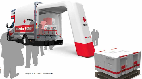
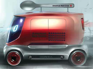
The third term of our collaboration resulted in graduate industrial design and undergraduate transportation design students producing concepts for the next-generation ERV. The ERV’s most common use is to dispense food during disasters and emergencies. Two of these designs stand out: ethan yeh’s lighthearted ERV-with-a-Spoon-on-Top and Pengtao Yu’s U-Haul Conversion Kit.
Yeh’s design responds to the need for visibility and messaging: The arrival of this ERV at a disaster location says “help is here” and broadcasts friendly reassurance. It also addresses a key enterprise need: to engender out-of- box thinking as the Red Cross set out to create the actual next-generation ERV.
Yu’s U-Haul Conversion Kit was framed by the need to address ERV inventory and response times. Currently the Red Cross has 340 ERVs, which cost over $90,000 each, distributed across the country. When a disaster strikes, some ERVs might be driven from distant locations taking over a week to arrive, while the need for food and water is immediate. In addition, the ERVs mostly sit idle. Yu solved both of these problems with a pallet-sized kit that converts a standard U-Haul box truck into an ERV. Everything is included: signage, lighting, work surfaces, food-service and storage equipment, and a power source.
While these converted U-Hauls wouldn’t replace the entire inventory of ERVs, they could cut the need for a large, expensive fleet and offer solutions close at hand for immediate deployment. U-Haul is already partnering with the Red Cross; kits could be staged around the country at dealer- ships or air-lifted into place as needed.
The Red Cross has implemented designs inspired by many of the Art Center student concepts. It experimented with Yu’s kit idea in recent disasters and found the con- verted U-Hauls quite useful. This past year, many student ideas were put to use in the redesign of the next-generation ERV, which has been touring Red Cross chapters across the country and recently was revealed to the public at Art Center.
Lauren Twohig, a leader in the creation of the new vehicle, said that when the Red Cross was considering the new design, its thoughts were limited to a few minor revisions to the existing design, but the out-of-box ideas like Yeh’s made possible greater leaps in thinking that gave birth to the next-generation ERV we see today.
Problem Found or Problem Framed?
Finding problems isn’t enough. Framing the issues surrounding the problems and maintaining vigilance against all forms of bias ensure that the vision gained through research is sustained throughout the project and that the project stays on track.


