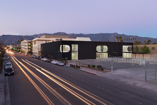
The 870 building at sunrise. Photo: ©Lawrence Anderson/Esto
As a teacher, I understand well the difference a space can make in the quality of the educational experience. Space affects learning. It makes a difference in how people teach. It makes a difference in how people create.
Which is why when you embark on creating a new space, you want to get it right. You need to talk to the right people and to ask the right questions if you wish to build that place where students can thrive and where faculty will love teaching. You want the space to elevate the whole.
A lot of careful thought went into making sure the new Fine Art and Illustration building at South Campus, 870 S. Raymond Ave. would engender the highest quality teaching and learning possible. I have no doubt that the building will do exactly that. Move through the new space, and you can feel it. It’s buoyant. It’s alive. You feel open to experience, to learning, to discovery—all thanks to the environment itself.

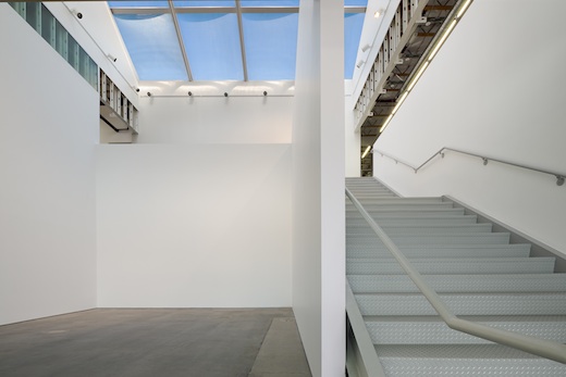
The atrium gallery at the 870 building. Photo: Darin Johnstone Architects
The building is doing much more than helping to alleviate overcrowding at Hillside campus—it’s expanding Art Center’s educational reach and resources, and it’s another important step in our goal of transforming South Campus from a “satellite” location to a full-fledged second campus.
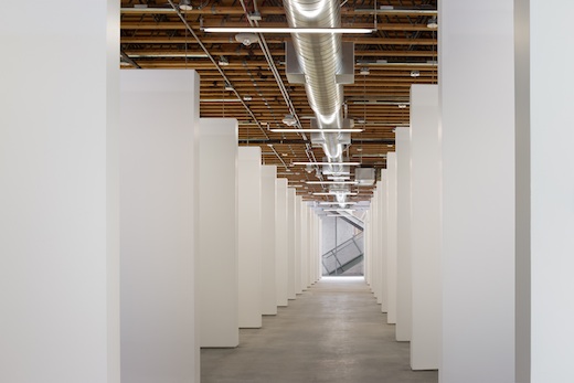
It includes state-of-the-art classrooms that can be reconfigured to meet our students’ changing needs. It features nearly 50 student studios—twice the number that existed at Hillside Campus—along with modern gallery spaces, including an atrium gallery with a two-story skylight, all of which will allow our students to create even more ambitious projects. And because many of these new spaces are street facing and open to visitors, more people than ever will experience our students’ stunning work.
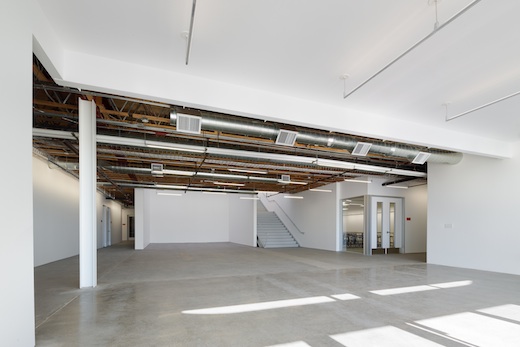
As we all know, artists and designers today no longer work in silos, and this new building allows our students to participate in the kind of cross-disciplinary interactions that are so important both at Art Center and in the larger world. The building includes several shared spaces, where both Illustration and Fine Art students can create and display their work for extended periods of time, allowing new opportunities for collaboration, critique and inspiration.

Student studios at the 870 building. Photo: Darin Johnstone Architects
Visit the building, and you’ll immediately notice the glazing. The classrooms and meeting rooms feature windowed walls and doors—a design decision made to allow passersby to see what’s happening inside and to invite interdisciplinary cross-pollination. It’s amazing how much the design of a space can lead to chance encounters and rich interplay in ways that could never be planned. It’s a philosophy I’d love to see implemented one day throughout the College.
In addition to the new galleries, studios and shared spaces, other highlights include: a dedicated Artmatters room for the College’s social engagement art concentration; and beautiful, environmentally friendly LED lighting by Vode, donated by company co-founder and Transportation Design alumnus Scott Yu (BS ’82). Coming soon is a sculpture courtyard for creating and exhibiting large, complex works, and a new Print Shop, three times larger than our current facilities, with enough room to accommodate students from multiple programs. I can’t wait to see what kind of magic our master printer, Fine Art instructor Tony Zepeda, is able to conjure in this new space!
Strolling through the halls and bright open spaces of 870, you would never guess what a drab, uninspiring sight it was just a few months ago. In fact, when we first purchased the former U.S. Postal Service sorting facility, the space was so mediocre that our first thought was to simply apply a quick fix that would last for five years and then tear it down completely.
I am delighted we decided to pursue a full renovation instead (and for the long term), with the help of generous alumni gifts and foundation grants. And I should stress that a large part of my excitement about the new building also stems from how its creation was really a product of shared governance. It’s a direct result of a conversation the Art Center community had about the College’s needs and how we should distribute our resources to our many programs. Once the decision was made to transform the building into much-needed facilities for the Fine Art and Illustration departments—their first new home in 40 years—we set about in a very specific and user-focused way to design a space to fit their needs.

Entering the 870 building. Photo: Darin Johnstone Architects
Those departments were heavily involved in the planning of the building, and the end result is a space that provides solutions for the issues they told us needed addressing. I’m proud of the fact that we were able to tackle this challenge in a manner entirely consistent with what Art Center teaches every day. It was a great process, and a good lesson too: get a building and the right people involved and you can create a space that is both useful and beautiful.
Finally—and I can’t stress this enough—the construction was completed on time! Our aggressive goal of bringing the building online for the Spring 2014 term couldn’t have been met without the hard work of Darin Johnstone Architecture, the Fine Art and Illustration Departments and the College’s Facilities and Technology Committee, comprised of students, faculty and staff. I’d like to thank particularly George Falardeau and Rollin Homer of Operations, for their outstanding leadership in bringing this project to fruition.
Sixth-term Fine Art student Elizabeth Freeman has the distinction of being one of the first students to set up her new studio at the new building. Freeman shared that she’s excited to have a clean, well-lit space, and that she appreciates being within walking distance of the nearby L.A. Metro Gold Line and a 24-hour pharmacy. “One simple detail that I love,” said Freeman of her new studio space, pointing to the base of one of her studio’s walls, “see how there’s a small space between the floor and the drywall? That lifts up the space and makes the whole studio airier.”
I hope you’ll take the time to visit the new building at 870 S. Raymond Ave. Let me know how it inspires you.
Lorne M. Buchman, Ph.D., is President and CEO of Art Center College of Design.


Hello to all,
This is a beautiful campus. Thank you for it. But why can’t we use it? I am sad to find out this is really NOT a place for work / learning / experimenting but instead:
a photogenic gallery homogenized space meant to provide a backdrop to the coming catalogs’ imagery and NOT a place for student to work and APPROPRIATE —
the hardware is there, you just have to update its software, dear ACCD executives, you missed the shot, but you are ALMOST there! Keep on trying!
I can’t help but feel that they dropped the ball on this one. There are only a handful of classrooms and that will barely alleviate the overcrowding on Hillside. The studios for Fine Art/Illustration students are great though!
Great looking building and spaces. It is good that Illustration (or term of “illustration”) is still listed as area of study and practice. At the old 3rd St. Art Center campus (Hancock Park?) everybody drew
even photographers/film people. It cannot be that way anymore but still talk up Art Center as a would be source for animators,manga, anime illustrators and possible production designers. Visually acute noticing base board reveal opens up all kinds of possibilities! …Best Wishes JH