
ArtCenter’s original 7th Street campus, 1947
At the beginning of 2013 the Design Office began evaluating the ArtCenter identity and considering possible adjustments that could enable a stronger, more flexible presence, particularly with online communications in mind. Our intent wasn’t to rebrand ArtCenter, but rather to make stronger use of the existing graphic identity elements that have always been associated with the College. This process led to a fascinating deep dive into the history of ArtCenter’s identity. We looked into the origins of the orange dot and studied 85 years of ArtCenter promotional materials to identify the things that represent the essence of who we are. Here’s what we found:
The dot
For 85 years the dot has been in nearly continuous use as a symbol representing ArtCenter, with only two exceptions: the period immediately following World War II, when the dot—particularly when it appeared in red—may have had too close an association with the Japanese flag; and for several years in the late 1980s, when the dot was put on sabbatical and then quickly reinstated after an outcry from the ArtCenter community.
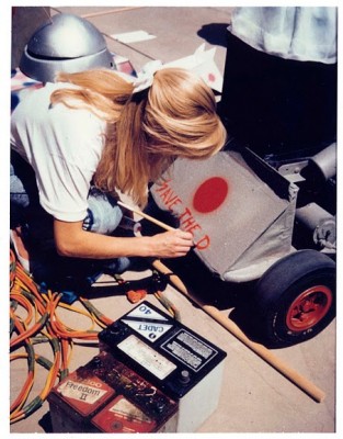
A student at work on the “Save the Dot” campaign, late 1980s
The form reflects the College founders’ interest in contemporary international design and the influence of the Bauhaus, but symbolically it also resonates with our Southern California location (in orange: sun, citrus, etc.) as well as the “here” to which the word “center” alludes.
While the dot is popularly associated with founder Edward “Tink” Adams, Robert Brown (BFA 32) has also claimed a role in establishing the dot as ArtCenter’s symbol.
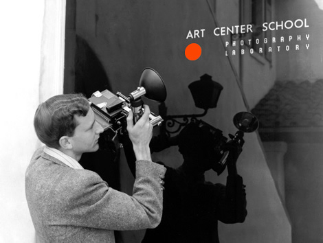
The color orange
Orange has had an association with ArtCenter since its inception in 1930, when the front door of the school had a border of red-orange and, in the front window, the name of the school was accompanied by a matching red-orange dot. The choice of red-orange has been attributed to Tink Adams’ affinity for the color, perhaps due to his love for Asian art.
After ArtCenter moved from its original location, there was no single color identified with Art Center for a period of time. But orange made an official reappearance in the mid-1960s, when Don Kubly (BFA 49) reintroduced it at the beginning of his leadership of ArtCenter in reference to the College’s formative years. Orange has been strongly associated with ArtCenter ever since, though the exact shade of orange has varied over time, from the original nearly red hue, to a less red Pantone 1655 by 2000, to the relatively yellow Pantone 021 in 2005 and now back to the somewhat more red Pantone 172.
Nomenclature
ArtCenter was founded in 1930 as The Art Center School, and the name was changed to Art Center College of Design in 1965 to clarify its identity as a professional, degree-granting institution with an academic focus on both art and design. Almost from the beginning, though, it has been known informally as “Art Center.” This short-form name was given a new level of legitimacy in 1986, when Kit Hinrichs’ (BFA 63) ArtCenter logotype was introduced, though after several years the words “College of Design” were added to the official logotype.
Beginning in the late 1990s the abbreviation “ACCD” came into fairly regular use, but it is used much less often now than it once was. Currently both “ArtCenter” and “ArtCenter College of Design” are used somewhat interchangeably.
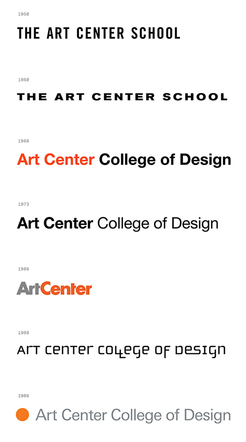
Evolution of ArtCenter’s name and typography, 1950–2005
Typography
Many different typefaces have been used in ArtCenter’s promotional materials through the years, but until 1965, when ArtCenter began a long institutional relationship with Helvetica, no one typeface could be said to have been a part of ArtCenter’s graphic identity. Helvetica was virtually the only typeface used in ArtCenter’s promotional materials from 1965 through 1986, and it was further institutionalized in the mid-1970s when it was chosen for the sign program at the College’s new hillside campus, parts of which are still in use today.
With the introduction of Hinrichs’ ArtCenter logotype, Futura became the ArtCenter identity’s typeface, but for much of the 1990s and until 2005 Futura’s role in the College’s overall public presentation was overshadowed by several design vocabularies developed for promotional materials by lead designers in the ArtCenter Design Office. The most notable among these featured the typeface Cholla, which was commissioned for ArtCenter by Denise Gonzales Crisp (BFA 82) and used almost almost exclusively in all ArtCenter materials from 1998–2001, in essence becoming the de facto College identity during that time.
In 2006 a new graphic identity by Takaaki Matsumoto (BFA 80) was introduced, and use of Univers was encouraged in promotional materials.
ArtCenter logotype
Throughout most of the history of ArtCenter’s identity there was no specific typographic lockup. Remarkably, the 1986 Hinrichs wordmark was the first. In the 1990s the words “College of Design” were appended to Hinrichs’ original design.
The lockup of dot and wordmark is an even more recent development. From the 1930s until 2006, when Matsumoto’s was introduced, the dot and the College’s name functioned separately.

The new graphic identity
The newly revised graphic identity has been influenced by the work of the many designers who have helped to shape ArtCenter’s image throughout the years, from the College’s earliest promotional materials in the 1930s, to the catalogs of the 1960s and ’70s, to Kit Hinrichs’ 1986 wordmark, to Rebeca Méndez’ (BFA 84, MFA 96) focus on materials and processes.
Using elements drawn from our 85-year history, the goal was to create a bold, flexible system that conveys ArtCenter’s core identity. The dot is now more prominent and is freed from being used only in a formal logotype lockup. The orange is stronger and closer to the original color associated with the College. The typeface gives a nod to our history while also providing a stronger typographic presence, especially online. And the name, with the space between Art and Center removed, helps differentiate us from other “art centers” and enables more relevant online search results. All together, these parts combined create a system that is both grounded in our history and optimized for the visual strength required in contemporary communications.

You can learn more about the updated identity system at artcenter.edu/identity.


