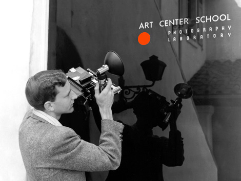
ArtCenter’s original 7th Street campus, 1947
At the beginning of 2013 the Design Office began evaluating the ArtCenter identity and considering possible adjustments that could enable a stronger, more flexible presence, particularly with online communications in mind. Our intent wasn’t to rebrand ArtCenter, but rather to make stronger use of the existing graphic identity elements that have always been associated with the College. This process led to a fascinating deep dive into the history of ArtCenter’s identity. We looked into the origins of the orange dot and studied 85 years of ArtCenter promotional materials to identify the things that represent the essence of who we are. Here’s what we found:
