
 Remember those days before the Internet? We hardly can.
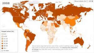
GOOD points us to a super-cool interactive map by the BBC that shows how Web use has expanded across the globe in the last 12 years.
From GOOD: “In the beginning, it was just the States, Canada, Australia, and (what?) Scandinavia with lots of people online. Today, Africa stands out as the one continent that isn’t wired.”
Check out the graphic: SuperPower: Visualising the internet

Share this:


