After more than four decades of service to Art Center, Laurence Dreiband, chair of the College’s undergraduate Fine Art Department will be retiring at the end of this month.
Dreiband leaves the College with an impressive roster of accomplishments: a robust program with increasing enrollment and plans for future growth; an impressive list of distinguished faculty and alumni; plans for Artmatters, a new area of emphases in public art and social engagement; and, most significantly, a dedication to the importance of the fine arts in the life of the College and of the culture at large.
To mark the occasion, Art Center alumnus, instructor and former chair of Foundation Studies Ramone Muñoz recently sat down with Dreiband to discuss the outgoing chair’s legacy, their beginnings at the College’s Third Street campus, and what the future holds.
Dotted Line: How did the two of you meet?
Ramone Muñoz: I first met Laurence before he met me. I was a student and I was aware of him because he stood out. In a world of older faculty members, he was the young guy who had taken over the Fine Art Department. We were all very aware of his presence. He was bringing in new Pop Art sensibilities and conceptual ideas to the College. So I knew of him first as an undergraduate, and then when I came back to school to teach and be an administrator, we became friends right off the bat. When I was associate chair with James Miho of the Graphic Design Department, we were all in a little bank of tiny offices. I’ve always been extremely fond of Laurence. And then I became Chair of Foundation Studies, and Laurence was still here.
Laurence Dreiband: But I remember you from back then as well, and also later when you came back to get your Masters in Fine Art. You brought in all your paintings, and I began to put it all together. I thought, Wow, Ramone also has this other life apart from graphic design, as an artist. And you were very serious about it. It was really interesting.
RM: Especially since my undergraduate degree was in Advertising?
LD: Right, you had done mostly design in your professional world. So it was fascinating. Art Center has had some extraordinary designers, like you and Agustin Garza, Michael Rey and Rebeca Méndez that have also gone on to do significant art.
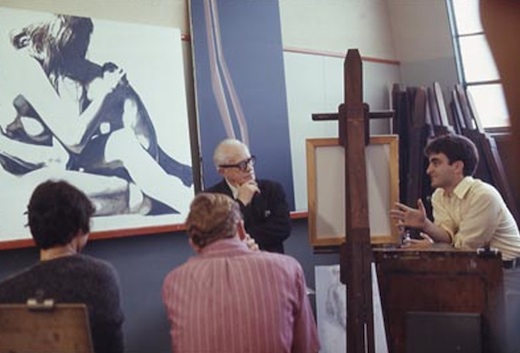
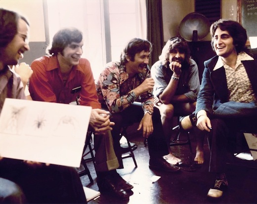
Graduate student Dreiband (far R) presenting to then Fine Art Department Chair Lorser Feitelson, 1967.
RM: Tell us a little about your early life.
LD: Well, my grandparents came from Russia and Austria and immigrated to America early in the 20th century. My grandfathers were both skilled craftsmen who worked with their hands. My parents were from New Jersey and New York, and I was born in Manhattan and grew up mostly in Los Angeles. There were few books in our house, there wasn’t much time to read, and I was the first in our family to go to college. My parents moved back to New York when I was in high school, and I left home at the age of 16 and returned to California. I was fairly independent as a teen and grew up early. I attended Fairfax High School and after school I would take a bus to Hollywood where I worked at a men’s store until 10:00 at night. The store was called Lucky’s, and it was across the street from the Warner Cinerama Theater on Hollywood Boulevard. With my earnings I purchased a green MGB sports car. I was liberated and industrious. I was totally fine.
RM: Who introduced you to Art Center?
LD: I had gone to USC to apply for their architecture program, an early enthusiasm, but the application deadline had passed and they told me I would have to reapply the following year. They said I would have a good shot but that my drawing could improve and they recommended taking a drawing class at Art Center. I expected to go back in a year to USC and pursue architecture. I also had a family friend who was a physician, an orthopedic surgeon, and he noticed that I liked to realistically render, and he suggested that I might want to become a medical illustrator. So that career, along with architecture, became two of many considerations. I had previously done a year of pre-med before I realized that I didn’t really want to be a doctor, however I did begin to think medical illustration could be interesting to pursue. So I started Art Center in 1964 as an Illustration major and after my third term, as I discovered the history of art, I switched to the Painting major.
RM: You majored in Illustration, but then you got your Masters in Film?
LD: Yes, Art Center didn’t have a film department back then, but I was increasingly in love with movies, particularly foreign and independent films, which were just beginning to be regularly screened in a few Hollywood theaters. So while still enrolled at Art Center, I was also able to also take classes at UCLA, USC and AFI. I created a 30-minute color movie for my Master’s project, which I wrote, edited and directed. I shot it in 16mm, and I had a friend who worked at Paramount Pictures, and he allowed me to work there on weekends and evenings, so I duped the film up to 35mm so that I could edit it on one of their old Moviolas.
I met someone who was producing Star Trek, he saw my film and offered me an assistant directorship. At the same time, I was still actively painting, and was also offered a one-person show at the prestigious David Stuart Gallery. So for me, it was a classic career fork in the road, and I had to decide which direction to pursue. As I thought about my interests in painting and cinema, I realized that I had found the process of making a student film with very little money quite stressful. I remember struggling to shoot a complex scene on La Cienega Boulevard with around 15 or 16 actors and extras, and everybody was so difficult and impatient because it was taking so long and they weren’t getting paid. I realized that the creative process that I enjoyed—writing and editing the movie— was actually solitary. On the other hand, directing all these people who weren’t being compensated was hell. So when I found myself at that fork in the road, I thought, I’m actually quite shy, and filmmaking involves crews and actors and is way too social for me. I preferred just going into my studio alone, turning on the rock-and-roll, and playing with paint. At that time, the kind of film that I was primarily interested in making was documentaries, and in those days there weren’t many opportunities for distribution, besides what was called National Educational Television, which predated PBS. So I opted for painting, though I’ve never lost my passions for movies and architecture.
RM: What were your initial impressions of the College?
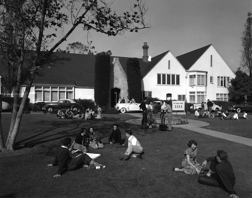
LD: I still clearly remember the Art Center School, as it was called then. It didn’t look like an art school. At least not to me. It was originally conceived by advertising men, and was I think intentionally quite different from the more typical bohemian environments of creative anarchy you’d find at other art schools. In my student days, it was situated in a ritzy residential neighborhood called Hancock Park, on Third Street. The campus’ façade looked like a grand English Tudor manor. It was set behind a large manicured green lawn. There was a circular driveway where there were conspicuously parked fine automobiles.
Inside, I remember there was no actual art gallery, but rather a hallway lined with cork walls, where they displayed push-pinned examples of remarkably well-executed student work: colorful graphic design, exquisite hand lettering, corporate logos, classical figure drawings, head paintings, gouache illustrations, fashion sketches, amazing perspective drawings, advertising layouts, technically accomplished 8×10 photographs—mostly portraits and product still life—and, of course, remarkable automotive renderings and scaled models. The displays emphasized exceptional skill and good taste.
I also remember there was a funky auditorium with uncomfortable folding metal chairs, and a tiny library with big European art, Illustration and design books. One nice feature of the Third Street campus was that there was a central outdoor area where people would gather, hang out, chat and eat during breaks.
RM: How about the people? What were they like?
LD: There were some remarkable faculty. They tended to have an industry-friendly, anti-art school look. The teachers wore business suits. Even life drawing instructors dressed formally with white dress shirts and neckties. The College also enforced strict dress codes and grooming guidelines for students: no slacks, jeans, shorts or mini skirts for girls, and no beards, side burns or long hair for boys.
RM: I attended Art Center in 1968 as a high school student in the Saturday High program. But I’ve heard you mention this before. That during the ‘60s, when people were protesting and throwing typewriters out of windows at UC Berkeley, Art Center was quite different.
LD: Right! The sixties was a time of radical social change and innovative art, particularly for young people—the civil rights movement, the women’s movement, a new sexual openness, growing opposition to the Vietnam War, race riots in cities, student protests in schools, the tragedy of Kent State, political marches, and the assassinations of John F. Kennedy, Martin Luther King Jr. and Bobby Kennedy. And the art world at that time was also changing radically—Andy Warhol and Frank Stella, Pop Art and Minimalism, conceptual and performance art were questioning received art values and rethinking art practice. Yet Art Center at that time seemed comfortably removed from all this, and fostered established values and technical mastery. It began to seem to me like an isolated bubble of disciplined creativity and “good taste.” So when I reflect now on what contribution, if any, I might have made in my 42 years of service to Art Center, I suppose one could say I encouraged the value of “bad taste,” irreverence and perhaps an openness to the unfamiliar. Marshall McLuhan once observed that good taste is the first refuge of the non-creative, and it is the last ditch stand of the artist.
RM: How did things change when the College moved to Pasadena?
LD: The new [Hillside Campus] in Pasadena had much better learning facilities, an expanded curriculum, and the enrollment eventually doubled. It came to embody the high standards of design excellence that Art Center stood for, and as much as the orange dot, this modernist building became a brand that distinguished Art Center from other schools. It was designed and built in the 70’s, a time when modernism was being questioned and the architecture that was attracting the most attention was called Post-Modern, which was a reaction to the austere formalism of the “International Style.” [Former Art Center president] Don Kubly preferred the refinement of an architect like Mies Van der Rohe, who was an advocate for the simple beauty in the functional. That was a philosophy also embraced locally by Craig Ellwood, who had designed Don’s modern wood-and-glass home in Pasadena.
RM: What about the fine art scene in Los Angeles? What was that like?
LD: The art scene in the ‘70s was much smaller and it was just beginning to define itself apart from the prevailing second generation abstract expressionism. Eventually an L.A. version of Pop, Assemblage, Super Realism and Cool School industrial abstraction emerged. The better galleries were generally on La Cienega between Melrose and Santa Monica Blvd.—Ferus, Rolf Nelson, Rico Mizuno, David Stuart, and Margo Leavin. The Ferus gallery generally showed the more edgy artists like Warhol, Ruscha, Kienholz and Bengston. I preferred the artists who showed next door at the David Stuart Gallery, like Llyn Foulkes, John Altoon, Vija Celmins and Tony Berlant. David Stuart eventually became my first art dealer, and I had several solo exhibitions there in the ‘70s. It was there that I showed my Palm Tree series and Grey Nudes. Nearby there was Nick Wilder Gallery, where David Hockney and Ron Davis showed. And for a while, in Westwood, there was the Dwan Gallery. The galleries were open late on Monday evenings, so it was a lively time to cruise the new exhibitions. And Artforum Magazine, initially designed by Ed Ruscha, first had their office on La Cienega before moving east.
RM: What kind of classes were you teaching before you became the department chair?
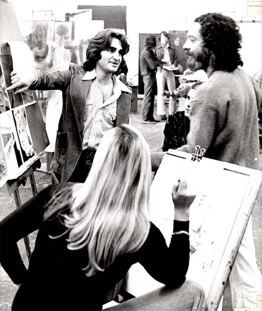
LD: I had been teaching first life drawing and later a more experimental class called “The Arts Lab.” The students in that class produced some radically new work unfamiliar at Art Center. One term the class had an exhibition called Irrationalism where they created a black maze with felt covered walls. Each turn in the maze revealed a different bizarre and somewhat surreal sculpture—for example there was an 8-ft. high white slab with a hanging jean jacket that slowly expanded and contracted, with an audio track as though it were breathing, and it dripped what appeared to be blood into a white butcher’s tray that was then pumped back up into the bleeding jacket; another sculpture I remember was a curved black iron sewer pipe, decked out in white lace and inside, reclining on a small satin pillow, lay a tiny birth control pill. For other Arts Lab projects we finally got use of the shop, which up until then had been exclusively for transportation students, and the art students began to make replications of familiar objects in wood as a way of learning how to develop 3-D fabrication skills. That art class began to have an impact and was written about and featured in the Los Angeles Times Magazine.
RM: Do you think the students coming through your Fine Art Department over the years actually found the mix with car designers, product designers and graphic designers to be an interesting opportunity for them?
LD: I absolutely think that’s true and I think that’s one of our strengths. There is a rigor and professionalism at Art Center, which is unique from other art schools, and the art students here demonstrate a similar commitment in conceiving and executing their projects. Art Center’s facilities are also unique, for example, we’ve sometimes taken advantage of the advanced technology in the industrial design shops by offering digital practices in sculpture classes. Art students regularly take electives and Transdisciplinary Studio courses with accomplished artists and scholars and also with preeminent designers, photographers and illustrators. This has enabled them to break down the prevailing categories of creative work, and redefine what art means and how it functions in our culture.
RM: What did you envision for Art Center in terms of fine art when you became department chair?
LD: My vision was to shift the focus of the Art Center Painting Department, which was a small classical academic figurative program that essentially taught representational skills—mostly drawing, composition and oil painting—to applied artists. Apart from Lorser Feitelson and Bernyce Polifka, there were mostly only excellent draftsman and traditional painters teaching in the department. Feitelson and Polifka both did beautiful hard-edge abstract classical painting, and taught primarily traditional art forms. I thought Art Center should have a more robust fine art program where contemporary art theories and experimental art making in multiple genres beyond painting, like sculpture, fine art photography and experimental film could thrive. I initially hired a new faculty of notable artists like Llyn Foulkes, Dana Duff, Scott Grieger, Karen Carson, Uta Barth, Roger Herman and Dagmar Demming to teach, and over the years many distinguished visiting artists like Richard Diebenkorn, Ed Ruscha, Charles Gaines, Sharon Lockhart, Richard Jackson and Martin Kersels.
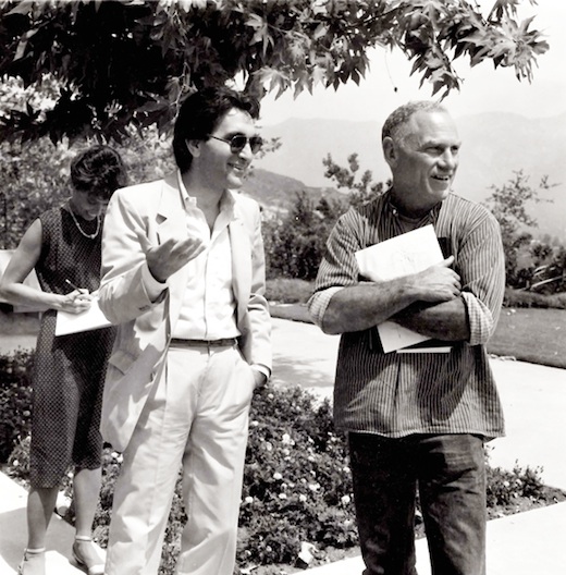
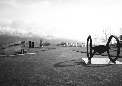
RM: Speaking of distinguished artists, I’ve seen a picture of you and artist Richard Serra looking at the Art Center Sculpture Garden at Hillside Campus in 1982.
LD: That project came about when I read that the Los Angeles County Art Museum (LACMA) was about to break ground on the construction of a big new building on Wilshire Boulevard, and that they were planning to temporarily place all their sculpture in storage. I had been thinking it would be extraordinary to have a notable sculpture garden on campus, like what UCLA had, and broached the idea of a sculpture garden at Art Center to Don [Kubly], and he was generally open. So I called Maurice Tuchman, the Senior Curator of Contemporary Art at LACMA, and asked him if LACMA would consider a five-year loan of some of its sculpture to Art Center, where the work could be properly displayed, open to the public and possibly influence a generation of young art and design students. Don readily embraced this idea and Maurice received permission from LACMA’s board.
In preparation for our field trip to the museum, I had shown Don some images of the sculpture in their collection—Calder’s colorful mobiles, which he loved, plus Anthony Caro’s work and David Smith’s Cubi steel piece. I still remember the day Don and I excitedly drove out to meet with Maurice Tuchman to select the 10 sculptures for Art Center. As we drove up Wilshire, Don slowed down and I pointed out four large concrete open cubes—Donald Judd’s minimalist sculpture—that I had hoped would be the centerpiece of the sculpture garden. Don looked horrified at the prospect. He remarked that he didn’t particularly like them, and in fact he thought they looked like the museum was doing some concrete sewer work. (Laughs)
He certainly didn’t think they belonged up at Art Center. And I’ll admit they didn’t look so great where they were, squeezed uncomfortably between the LACMA building and the sidewalk. So as we walked from the parking lot to meet with the curator, I had only five minutes to convince Don to reconsider. And he did! He was open to the argument that great art would compliment the great architecture and enrich the learning environment for our students. And that was not an inexpensive decision—the large heavy artworks required huge trucks to transport and huge cranes to install, plus it required custom-built concrete platforms.
In the end, the massive Judd sculptures looked incredible at Art Center. They were surrounded by green grass on the bluff overlooking our sweeping view. I think Don genuinely came to admire them. So for a time we had world-class sculpture on our campus. Later, Stephen Nowlin and I were able to leverage this loan from LACMA and borrow other major sculptures by artists like Bruce Nauman, Mark Di Suvero and Richard Serra.
RM: I don’t think of Don Kubly as being a strong advocate of controversial art.
LD: No, he didn’t like messes. And fine art was often messy. Don preferred clean, well-crafted artwork. He appreciated vivid color and demonstrative skill. He also admired artists with a strong sense of design like Ellsworth Kelly and Lorser Feitelson. Though he also seemed to like my work. He didn’t like raw, visceral expressionist art. It’s funny, on his way in from the faculty parking lot, he’d often check out the large fine art studio, room 105, and he would sometimes get upset if someone had spilled paint or didn’t clean up properly. Once a student had taken an orange cafeteria tray and used it as a palette. Don called me into his office and reprimanded me, told me that I wasn’t monitoring the room properly, and then he produced the tray, out from his under desk, as an example. I teased him and said, Oh, that’s really good, Don. I’m going to put that up on the wall! (Laughs) He had a sense of humor but he was very protective about this place. He really loved the Elwood building and this kind of minimalist clean architecture, and he had very strict rules about what people could keep in their offices. Years later after he had retired, he would visit and we would walk down the halls together. He would see all the posters and flyers randomly taped on the walls and he thought the standards were slipping and the place was going downhill. (Laughs)
RM: The sculpture garden predated the Williamson Gallery, correct?
LD: Right. I wanted to create a learning environment at Art Center where students would be around great contemporary fine art, and so before the College had the Williamson Gallery with Stephen Nowlin as director, I organized art exhibitions in what is now the Transportation Studio south of the Student Gallery. It was more or less available for the first half of each term, and I regularly began to present contemporary art exhibitions by notable artists like Wayne Thiebaud and David Hockney, who would also lecture to our students in the Ahmanson Auditorium. When we first opened the Pasadena campus, we had a beautiful Richard Avedon exhibit, with very large black-and-white photographs, in that space.
It was there we held impressive group shows with important New York contemporary artists not often seen in Los Angeles, like Frank Stella, Kenneth Noland, Jules Olitski, David Salle and Ron Davis. I borrowed many of these works through special arrangements with their dealers, like the Leo Castelli’s Gallery in New York and the John Berggruen Gallery in San Francisco as well as the Pasadena art collector Robert Rowan. One impressive exhibition we presented was David Hockney’s large composite Polaroid photographs, which included his 30 ft.-long representation of the Grand Canyon made up of hundreds of small SX70 polaroid snapshots. And I produced a series of art posters for these art exhibits that were sold around the world in art museums and bookstores as a way of publicizing that Art Center was more than a commercial art and design school.
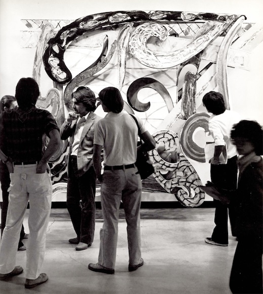
Dreiband (3rd from L) with a group of students in front of a work by Frank Stella at Art Center, 1980.
RM: What are some of the major changes the Fine Art department has experienced over the past four decades?
LD: First and most important, after the first 40 years of being essentially a supportive program serving mostly illustrators and designers, we became a formidable fine art program. We went from offering a few traditional life drawing and painting classes to a vital and innovative contemporary fine art program. I hired a new faculty of notable and actively exhibiting artists who had not been educated at Art Center— a novel concept at the time—and offered a new experimental curriculum that explored modernist art history and critical theory. We quadrupled the enrollment and began to attract more ambitious and serious art students.
After David Brown became president [of Art Center], with his enthusiastic support, Fine Art at the College continued to grow and expand. We built the new Williamson Gallery in a former central open space with the generous support of trustee Elyse Williamson, and he appointed my assistant and graduate art alumni Stephen Nowlin as director, who has conceived and presented important art and science exhibitions.
I convinced Tony Zepeda, who had been a master printer at Gemini G.E.L., where he had worked closely with many prominent artists like Jasper Johns, Robert Rauschenberg, Frank Stella, Ellsworth Kelly and David Hockney, to leave his job and develop a printmaking studio for lithography, etching, silk screen and photogravure at Art Center. The printmaking classes have become the most popular Fine Art electives for non-Fine Art majors at Art Center.
With David Brown’s support we also created world class graduate programs, under the direction of then-Liberal Arts department chair Richard Hertz, and hired a distinguished new faculty that included artists like Mike Kelley, Stephen Prina, Lita Albuquerque, Jeremy Gilbert-Rolfe and Patti Podesta. As the Graduate Art program slowly grew, most of these teachers also taught in and enriched the undergraduate program.
RM: A number of important artists have graduated from your program over the years. Did any of them make a big impression on you as students?
LD: You know, it has been deeply gratifying to nurture and witness the growth and becoming of many internationally prominent artists. The first major artist who studied with me at the Third Street campus was Mark Tansey. After his BFA at Art Center, Mark went on to grad school at Hunter College, and later did editorial illustration for The New York Times. He eventually arrived at his brilliant monochrome paintings that illuminate critical thinking and modernist philosophies behind contemporary art practice. His works have been extensively exhibited and collected in many of the world’s major museums. For example, his witty The Innocent Eye Test belongs to the Metropolitan Museum of Art in New York.
We are clearly living in a world of accelerated change, unprecedented technological advance, instantaneous global communication, collisions of multiple cultures, political and social upheavals, and economic uncertainty. The old distinctions between idealism and pragmatism, art and design, making stuff and making meaning seem to be changing. And some of Art Center’s most successful fine art undergraduates—like Mark Tansey, Pae White, Jorge Pardo, Doug Aitken, Jennifer Steinkamp and Hiroshi Sugimoto—have been influenced by Art Center’s applied artists and designers, and in turn instrumental in blurring these boundaries.
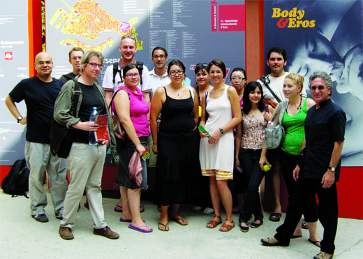
Dreiband (far R) with instructor Jan Tumlir (3rd from L) and students at the 52nd Venice Biennale, 2007.
RM: Now, let’s talk a little about the future. Tell us about the new Artmatters program.
LD: One of the pleasures in teaching art is you don’t teach the same thing year after year. Art is always changing and evolving. And it’s always reinventing what art means and how it functions. This past year I was instrumental in creating Artmatters as a complement to Designmatters. I have a 22-year-old daughter, Eliot Rose Dreiband, who’s very interested in pubic health issues through non-profit organizations, particularly those that help disadvantaged children. There now seems to be a generation that reminds me of my generation that came of age in the ‘60s, that are actively asking, How can we make the world a better place? They’re concerned with our fragile environment and global issues of development in emerging countries. And there are young artists who are looking for something beyond making objects and commodities—paintings, photographs and sculpture, for sale in galleries—and instead are interested in creating, for example, art in public spaces, beyond the privileged white cube, that can reach people who are not involved in the art world.
There are recent public works that commemorate tragic events and help us to heal. I remember going to New York last year and seeing the 9/11 Memorial in lower Manhattan, and being so moved by what they had done with the water moving into the footprints of those destroyed buildings. It was clearly inspired by Michael Heizer, an artist who’s created similar negative cubes and submerged geometric forms at the Dia Art Foundation. And the year before, I was in Berlin and saw what Peter Eisenman had created for the Memorial to the Murdered Jews of Europe. I think that artists, architects and designers are communicating in a very rich way to a much larger audience outside the galleries. And again, those memorials are another example of the blurring between the design and art disciplines. And of course Maya Lin’s work is collapsing that barrier as well.
My hope is that Artmatters can eventually become as successful as Designmatters at Art Center, through fostering artists who desire to work outside the marketplace, and who seek increased social engagement and participatory forms of art practice in an evolving conception of public art activity—from site-defining projects to innovative and interactive social spaces that may one day redefine the role of art and its relationship to community. Of course Artmatters has the potential to influence more than Fine Art students, it can stimulate meaningful photojournalism, editorial illustration and documentary filmmaking at Art Center. It is the right time. It is needed. And it is another example of why I’ve stuck around all this time. Whenever I thought of moving on, something else occurred to me that I thought could make Art Center even better.
RM: How should the Fine Art program evolve in the future?
LD: The thing that’s going to be really exciting is to see where the department goes next, without me. It’s been wonderful for me to see other new department chairs arrive and move the school in unfamiliar directions. I hope the next Fine Art Chair has a fresh and innovative vision, one that can build on all that the faculty and I have accomplished, yet take us elsewhere. I’ll be as excited as anyone to see somebody new come in and not respect what I’ve done and say, Oh no, this is where Fine Art should be at Art Center. That will be thrilling to watch.

Grad Art faculty (L to R) Laurence Dreiband, Richard Hertz, Sabina Ott, Stephen Prina, Mike Kelley and Jeremy Gilbert-Rolfe, 1989. Image (c) Art Center College of Design/Steven A. Heller
Related:



Congratulations Lawrence ! You were a wonderful part of my ACCD experience. Being in the photography department I only had you once, but it was such a stimulating class and very unique to ACCD. I still use your approach all the time trying to think outside the box and be aware of good art & design in all things.
cheers ,
Rocky
’75
Rockyshoots.com