
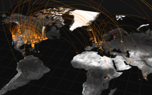
A still from artist Jer Thorp’s “Just Landed” (2009), a work that visualizes tweets from air travellers.
On Thursday, May 23, Art Center, Caltech and NASA JPL hosted From Data to Discovery, a one-day symposium on the emerging science of big data visualization that attracted leaders of the field from across the nation.
Speakers included Fernanda Viégas and Martin Wattenberg, co-leaders of Google’s “Big Picture” visualization research group in Cambridge, Mass., Jer Thorp, an artist and cofounder of the New York-based multidisciplinary research group The Office for Creative Research, and Golan Levin, an artist and director of The Frank Ratchye STUDIO for Creative Inquiry at Carnegie Mellon University.
Caltech’s Beckman Auditorium was packed with approximately 500 members of the art, design and scientific communities eager to engage in a discussion on how data visualization has transformed from a mere means of representation into a tool for discovery.

Interaction Design chair Maggie Hendrie speaking at From Data to Discovery. Photo: Chuck Spangler
“Artists and scientists all have practices that involve questions, research and creativity,” said Dr. Scott Davidoff, manager of the Human Interfaces Group at NASA JPL, pointing out why its important for members of the different communities to explore the topic together. “Research is the business that we do, and creativity is the currency.”
Davidoff—who, along with Maggie Hendrie, chair of the Interaction Design Department at Art Center and Hillary Mushkin, a visiting professor of Art and Design at Caltech, organized the event—also thanked Dan Goods, an Art Center alumnus and visual strategist at JPL, for the suggestion of bringing the different communities together.
“At Art Center we have a culture of investigating, prototyping and iterating,” said Hendrie when explaining what Art Center can contribute to the field of data visualization. “A practice we feel meshes very nicely with our colleagues at JPL and Caltech. But we also bring to the table a bit of divergent thinking. We ask how do we provoke, how do we communicate, how do we persuade and how do we tell stories.”
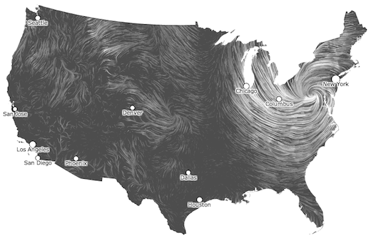
2012′s Hurricane Sandy as it appeared on Fernanda Viégas’ and Martin Wattenberg’ “Wind Map.”
Attendees spent the day learning about the origins and philosophies behind projects ranging from Viégas’ and Wattenberg’s Wind Map, which animates the United States’ surface winds based on data pulled from the National Digital Forecast Database, to Jer Thorp’s Exo, a visualization tool to explore the findings of NASA’s Kepler space observatory (“The general public needs to be pulled in. You don’t lose the ‘ahh’ by adding in an ‘ooh’), to Levin’s The Secret Lives of Numbers, which shows the popularity of every integer between 0 and 100,000 since 1997 (“I’m interested in things that are not necessarily useful, but that are provocative”).
Other presentations included: Jeff Heer, an assistant professor in the Computer Science Department at Stanford University, who shared jaw-dropping interactive data visualizations, including scatter plot matrixes, parallel coordinates and hierarchical edge bundling; Eric Rodenbeck, founder of the San Francisco-based Stamen design firm, talked about his Surging Seas project and how to best communicate science to the general public (“Look for that grain that’s going to make sense of it all”); and Anja-Silvia Goeing, a lecturer of history at Caltech, who showed the links between how data is presented today to how objects were represented in early scientific disciplines (i.e. cabinets of curiosities).
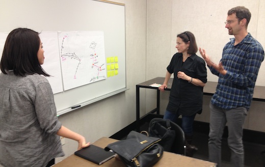
Viégas and Wattenberg critique a project by Art Center alumnus and JPL designer Jessie Kawata.
The following day, the same leaders that spoke at the symposium participated in small workshops at Art Center with invited faculty, staff and students from the participating institutions. The day was a rare opportunity for students to brainstorm with and receive feedback on their current data visualization projects from individuals who are the very best in their fields.
And when it comes to data visualization and collaboration between Art Center, Caltech and JPL, this symposium and related workshops are only the beginning. At the symposium, Mushkin announced that she, Davidoff and Hendrie have been working together on a “summer of visualization,” which includes additional guest speakers including Ben Fry, principle of Fathom and co-creator of the Processing computer language, and Aaron Koblin, the creative director of Google’s Data Arts Team.
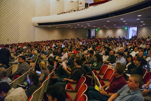
From Data to Discovery attendees packed Caltech’s Beckman Auditorium. Photo: Chuck Spangler
Mushkin also announced a new internship program beginning this summer in which five interns—three computer science students and two design students—will be working together on three sets of visualization problems for Caltech and JPL.”We’re really excited to dig in and enact this idea of collaboration,” said Mushkin. “And we’re excited to begin a new collective conversation and new persepctive on data and visualizing data in new ways.”
From Data to Discovery presentations will be made available on YouTube in the future. Stay tuned to Dotted Line and Art Center’s Twitter feed for visualization information as we get it.


