 Marian Bantjes, fresh from her appearance at TED, stopped by the Ahmanson Auditorium last Thursday to share some riveting stories behind her internationally-recognized work. The Canadian artist, typographer, designer and writer touched on her project selection process, the philosophy behind her unique aesthetic and the difficulty of finding something worth saying.
Did you hear Bantjes speak? What did you think?
Here are a few highlights:
On her early career as a typesetter:
As a typesetter, I didn’t do any creative work at all. The designer told me what to do and my job was to know typography well enough to get it right. I did this for ten years. Most people who want to be designers think of this as tedious. But I learned a lot about typography and I loved that job. It’s something undervalued in most design today. People want to do the fun stuff, the crazy stuff, the stuff that I do now, but it’s really important to be able to get pleasure in the fine details.
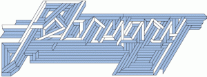
On the “February” she designed for Texas Monthly:
People are going to figure out it says “February,” and if they don’t, they’re not going to die. There are times and places where obscurity is a good thing. I know we’re taught to be clear in all things and at all times, but I really don’t believe that. With the exception of emergency exits and vital information, I think people like to use their brains. People like to be puzzled by something, wonder about it for a bit, feel motivated to figure it out and get a reward.
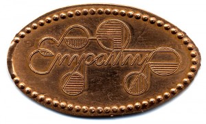
 On her Empathy Penny:
Finding content for pieces can be really difficult. I work with words. I work with them very intently. I just can’t spend that much time working on something that has a boring or stupid message. I see a lot of wordcraft work where people have done very elaborate things with words but they don’t say anything. Here’s one word that I thought was worth saying. I thought, “What would people want to have on a penny?” Somebody might take this penny out of their pocket, look at it and remember to feel empathy for other people.
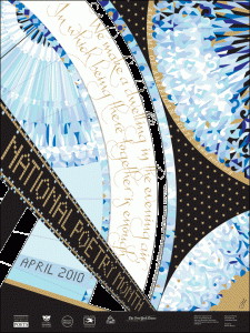
On her poster for the upcoming National Poetry Month:
I view most projects not on how much money I’m being paid, or any other considerations other than: Who’s going to see it? What’s it for? And what’s it worth to me? In this case, it’s a poster of which they’re printing 200,000 copies. They’re sending them out to schools all across America. It promotes poetry. To me, that’s worthwhile. It doesn’t really matter how long I spend on it. The opportunity to get something out there that’s hopefully beautiful and compelling is what motivates me.


