Author Archives: Mike Winder

Tony Luna: Making Change Happen

Change naturally occurs as careers evolve. Sometimes change is forced upon us; other times we have to make it happen.

Based on the principles laid out in his book, How to Grow as a Photographer: Reinventing Your Career, creative consultant, artist and educator Tony Luna created Crafting a Meaningful Career, a series of Art Center at Night courses aimed at helping mid-career professionals revitalize their career perspectives.
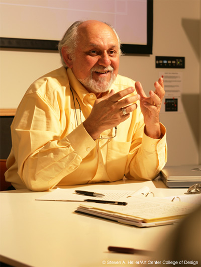
Luna

We recently took a much-needed break our day-to-day assignments to talk to Luna about these courses.

Dotted Line: Tell us about Crafting a Meaningful Career.
Tony Luna: The course is loosely based on my own personal life. Looking back at my career, I realized that every five to seven years there was some change that had to take place. Sometimes it was caused by the economy, sometimes it was caused by technology, and sometimes it was caused by boredom. I started talking to other people, and virtually everyone I spoke with experienced the same challenges. The basic tenet of the course is that we have to change and we have to grow, so the Crafting a Meaningful Career courses are about taking control and creating a new path for yourself. It could be a small change, or it could be a large one. I advocate that people take a serious, mature look at what they’ve accomplished, give themselves credit for all they’ve been able to achieve, and then plot out a plan for where they’d like to take their career.

Dotted Line: Do people commonly feel like they need to start all over, and that all they’ve done up to this point is useless?
Luna: People acquire skills along the way that they don’t even recognize. They pick up organizational or communication skills, learn new languages or become computer savvy. And they think that’s just what they had to do. We often float through life and not recognizing the impact our personal experiences can have in expanding our business opportunities. I have a class assignment called “asset matching,” in which I ask students to examine their personal skill sets, experiences, interests and influences. They write down what they have going for them, and then as a group we try to find new options for how they can turn their career into something that makes them excited about starting each day. That’s the “meaningful” part.

Continue reading

Art Center Garden Makes Its Debut

Erik Molano, Heidrun Mumper-Drumm and Linda Estrada at the ribbon cutting

There was plenty of goodwill sown at the recent ribbon-cutting ceremony for the new Art Center Food Garden.

Speaking to the assembled crowd, instructor Heidrun Mumper-Drumm said student group EcoCouncil first approached her a year ago with the idea of creating a garden for the College. She was enthusiastic about the project, but acknowledged there were some setbacks initially.

“We tried and we tried, but we just couldn’t get it going,” she said. “But then, we found out that collaboration was the secret ingredient that had been missing.”

That collaboration meant EcoCouncil teamed up with Art Center Student Government, the Facilities department and individuals from the Technical Skills Center to move the project forward.

Art Center’s Vice President of Real Estate and Operations George Falardeau was on hand to do the ceremonial cutting of the ribbon. Falardeau, along with Mumper-Drumm, thanked many individuals who helped make the garden a reality, including Art Center President Lorne Buchman (“He was a big proponent of the garden”), Art Center Student Government President Erik Molano (“Erik has taken this garden on as his own personal mission”) and Environmental Design student Carlos Vides (“He came up with the original sketches for the garden”).

“Art Center as a whole is very proud of this garden,” Falardeau said before cutting the ribbon.

For more information and to reserve a plot within the Art Center Food Garden, visit the garden’s Facebook page.

Designer Sami Hayek on Art Center at Night

Hayek

With registration for the Fall Term of Art Center at Night (ACN) beginning Monday, August 15, you may find yourself wondering who exactly enrolls in Art Center’s continuing studies program.

ACN offers hundreds of courses that attract everybody from art and design professionals looking to enhance their skills, to mid-career professionals looking for a creative challenge, to individuals preparing a portfolio for admission to one of Art Center’s full-time degree programs.

Over the years, many students have made the leap from taking an ACN course to being a full-time Art Center student.

We recently spoke to Art Center alumnus Sami Hayek, whose new Espacio Sami Hayek line debuted last May at the International Contemporary Furniture Fair in New York. Hayek credits ACN for helping him assemble a portfolio that lead to his admission into Art Center’s Environmental Design program.

Here’s what he had to say:

“I was studying business administration when, one day, I realized that I was going to have a boring life ahead of me if I continued this pursuit. At first I was leaning more towards architecture, but after researching the field I realized I wanted something more diverse, which led me to environmental design.

“I knew Art Center had the best Environmental Design program out there, but I didn’t know how tough it was going to be for someone like me—coming from business with practically no design skills—to get admitted into the program. When I visited Patricia Oliver, chair of the department at the time, she asked if I had a portfolio. When I said no, she suggested I attend Art Center at Night (ACN) in order to build one.”

Continue reading

Artist Margaret Wertheim on HYPERBOLIC: Reefs, Rubbish and Reason

Werthheim

Last week, Art Center celebrated the opening of exhibition HYPERBOLIC: Reefs, Rubbish and Reason—on view through August 21 in the Williamson Gallery—with a reception and a pair of presentations in the Ahmanson Auditorium by Jerry Schubel, president and CEO of the Aquarium of the Pacific, and Margaret Wertheim, writer, artist and co-curator—along with her sister Christine Wertheim—of the Hyerpbolic Crochet Coral Reef project.

We spoke with Wertheim following the reception about what’s new in the coral reef, the mysterious Midden Monsters and growing an installation.

Dotted Line: The crochet coral reef project has travelled around the world. What’s the most unique thing about this project as it appears here in the Williamson Gallery?
Margaret Wertheim: We decided for this show that we wanted to make the plastic a major feature. Not only did we have a lot more of the plastic than we’ve had before—we’ve been collecting it for four years—but here we also had the space. That big pile of trash in the main room is new. We have shown the trash in a very small form once before, but here it’s a huge new element of the exhibition. Another new feature is the Coral Forest room. That is completely new. No version of that has ever been shown before. In fact, we built that in situ. And finally there’s the mathematics room. We’ve never had a whole room devoted to the math before. So three of the four rooms in this exhibition are completely new.

Dotted Line: Are some of the organisms in this particular installation a mutation of the Midden Monsters?
Werthheim:
The Midden Monsters are pieces crocheted out of plastic trash. When they’ve been shown in the past—which is rare—the Midden Monsters have been pinned to the wall surrounding it. What happened in this case was that many of them got incorporated into the big white plastic piece in the Coral Forest room. The Midden Monsters, as a flock, transformed themselves into one giant Midden Monster. This show has a tendency to be very organic and, like living things, it evolves and morphs in response to the room that it’s in. The whole show grows to fit its environment. And since each environment is different, things have a tendency to come into being in new ways in each space.

Dotted Line: You mentioned in your presentation Wednesday night that the installation needs to grow into each space that it shows.
Wertheim:
This work is very transmutable. It really is organic in the sense that it doesn’t have a fixed-down form. There are parts of it that do, like the bleached reef, which has pieces that look more literal than the others. That’s what we call our “classical work” and those are now fixed. We basically congealed those over the years into their perfect state. But all the rest of it changes each time we do the show. So every time we do it, it really is different. And the work encourages that because each piece is handmade, and that handmade philosophy extends to the exhibitions as a whole. A way to think of these exhibitions is that each exhibition is a handmade installation.

Continue reading

Walking in the Consumer’s Shoes: Product Design Alum’s Urshuz is All About Customization

Grant Delgatty's Urshuz line of shoes allow consumers to mix and match a shoe's uppers and soles

Never heard of Urshuz? You will soon enough.

Perhaps you’ve read about Art Center Product Design alumnus and faculty member Grant Delgatty’s entry, the Soleman Redemption, into last month’s Red Bull Soapbox Race in downtown L.A. The vehicle Delgatty drove—which could shed its layers to transform from a shoe, to a sandal, to a sole—was essentially a moving advertisement for his new line of footwear, Urshuz, whose main hook is that consumers can mix and match shoe uppers and soles into a variety of material and color combinations.

Urshuz (pronounced “yer shoes”) are currently available for purchase at the Museum of Contemporary Art Chicago, DNA Footwear in Brooklyn, ShoeLab in Quebec and a number of other retail locations. And next month, Delgatty’s line hits the big time when the customizable shoes will be available at Urban Outfitters stores nationwide.

We sat down with Delgatty—whose history in the footwear industry includes stints designing for K-Swiss, heading up design at DVS Shoes and holding the position of Vans’ director of design for seven years—to get to the very sole of Urshuz.

Dotted Line: How did Urshuz come about?
Grant Delgatty: I’ve been in the footwear industry for a long time, and one of the growing trends I’ve observed is that consumers want to express themselves and they want to feel connected to their products. I set out to develop a method in which a consumer could become more involved in the design process of their footwear.

Continue reading

Another Day in the Life: Saturday High Instructors David Sotelo and Evah Hart

Sotelo

Last month we introduced you to Olivia Crawford, an alumna of Saturday High, Art Center’s program for high school students (grades 9 through 12), who shot images for Nike Sportswear’s Look of Sport: Los Angeles campaign. Olivia spoke very highly of the “Day in the Life” projects she completed in Saturday High’s Photography 2 class, saying they were important in shaping her experience with photography.

We wanted to learn more about “Day in the Life,” so we chatted with David Sotelo and Evah Hart, who co-teach Photography 2, to learn more about the project, the process of discovery, and teaching at Saturday High.

Dotted Line: Tell me a bit about the “Day in the Life” project.
Evah Hart: We start almost all of our classes with “Day in the Life.” It’s important because it establishes the recognition that our student’s lives are important and a valid place to be pulling from to create work. In the project, we have them shoot three disposable cameras in one day. And we ask them to include the time stamp on the prints. The fact that they’re shooting a lot of pictures really forces them to recognize things in their life that they wouldn’t otherwise see.

Dotted Line: These disposable cameras aren’t the digital kind, right?
Hart: Yes, and that’s important because we’re not editing. We actually have them cover up the viewfinder, too. We want them to react to their life rather than trying to make beautiful pictures. The project diminishes the expectations of beauty and the ideals we’re confronted with on an everyday basis.

Continue reading

Day in the Life: A Saturday High Alum Shoots for Nike

Angela Choi, as photographed by Olivia Crawford for Nike Sportswear.

With most of us walking around with YouTube, Facebook and Twitter on our phones, it’s no wonder why it has become increasingly difficult to be aware of our own surroundings.

But don’t tell that to Saturday High alumna Olivia Crawford. The Pasadena native recently graduated from Polytechnic School and is now studying art and art history at the University of California, Berkeley. Crawford’s passion for capturing the people and events in her life through photography not only made her a standout in her Saturday High courses, but it also landed her a very cool gig during her last winter break.

An ad agency discovered her work on Flickr and asked her if she’d like to be involved with Nike Sportswear’s “Look of Sport” campaign. The job involved shooting photographs of athletic and stylish individuals from Los Angeles, photographed in a style remaining true to her own aesthetic.

Crawford agreed, and the campaign appeared online last month.

“Olivia is a disciplined, focused and intelligent kid,” says Saturday High instructor David Sotelo, who along with co-instructor Evah Hart, taught Crawford twice in Photography 2. Sotelo recalls Crawford being particularly inspired by Nan Goldin and Larry Clark, two artists whose work he and Hart regularly feature in their class. “The work Olivia did for Nike—that aesthetic evolved out of the inspiration she got from those photographers, artists who were using their everyday life as a diary.”

We recently caught up with Crawford to learn more about her experiences in Saturday High and her work with Nike.

Dotted Line: Which Saturday High classes did you take?
Olivia Crawford: I took an oil painting course my sophomore year of high school. We painted from models and that class really helped me with my later photography courses, Photography 1 with David Sotelo and Photography 2 with David and Evah Hart, which I took twice.

Dotted Line: What did you learn in those classes?
Crawford: Both emphasized making your own projects and learning to be sensitive to your environment. We came up with projects based on what we were seeing in our own photography and what we were reacting to in our environment.
Continue reading

Stop the Presses: Students Dive Head First into Editorial for the iPad

It’s hard to believe the iPad has only been with us for a little over a year. The now ubiquitous device debuted last April and sold three million units in 80 days, making it the then-fastest selling device of all time. The publishing world quickly took notice and recently began publishing iPad-specific publications. Virgin CEO Richard Branson’s magazine Project was the first such publication out of the gate last December, and this February Rupert Murdoch’s News Corporation launched its iPad-only newspaper The Daily.

Sensing a shift in the industry, Nik Hafermaas, Chair of Art Center’s Graphic Design Department, sat down with instructor Carla Barr to discuss the possibility of creating an iPad design class. Barr, who has taught Editorial Design extensively, saw an opportunity to bring her area of expertise and this new technology together and suggested creating an iPad Editorial class.

“Students a few years ago had very mixed feelings towards interactive media,” says Nik Hafermaas, who thinks this class, along with classes like MediaTecture and this coming term’s augmented reality studio—sponsored by LAYAR and co-taught by writer Bruce Sterling—fall into the burgeoning arena of transmedia design and are important steps for where Art Center students needs to be headed conceptually. “Now students are aware of the ubiquitous nature of these tools,” he says. “They’re starting to enjoy using them, and see that somebody needs to design the content.”

The experimental class—whose test run took place last term and which is being offered again Summer Term—attracted the attention of two education specialists from Apple, one who visited the class and another, according to Barr, who said there was no other class he knew of focusing on editorial for the iPad.

We recently chatted with iPad Editorial instructor Barr and two students who took the class, Graphic Design majors Megan Potter (who graduated last month) and Jinsub Shin about their experience and digital publications.

Carla Barr, Instructor

Dotted Line: Who took this class?
Carla Barr: Surprisingly, everybody in the class was part of the graphics print area of emphasis. They were sixth, seventh and eighth term students whose last interactive class had been early in their Art Center education.

Dotted Line: What kind of work did they do in class?
Barr:
They created their own magazines and newspapers. I wanted them to come up with the content, rather than give them an assignment. So they came back with concepts and I had them cover the walls during the second week with their ideas.

Dotted Line: Each student created a magazine?
Barr:
A sample of a magazine. They had to create a minimum of three articles, a table of contents, a cover and two covers for future issues. And there had to be interactivity and motion in each story. This was also an editorial class, so I taught them the structure of a publication, use of typography, imagery and sequencing.

Although the content would end up on an iPad, I still had to make sure they understood the fundamentals and everything my editorial students from the past would have to learn.

Continue reading

The Limits of Control

Ask Art Center faculty and alumni what changes they think the next 80 years of art and design will bring, and you’ll get no shortage of compelling answers.

Autonomous cars! Augmented reality! Networked schools of fish! (No, I’m not making that last one up.)

David Erven, Dihedral Tile, detail (2008)

All topics worthy of in-depth exploration, but there’s one emerging trend that keeps kicking at the door. It’s a trend that appears across many disciplines and fulfills deep-seated human needs, ensuring it won’t be going away anytime soon.

This trend doesn’t have a name per se. It goes by many names: DIY (“Do it yourself”), hacking and open-source are just a few of its monikers. Whatever you call it, this trend represents a paradigm-shift for the creators of intellectual property.

It’s a trend where end-users are increasingly expecting more control over their products and experiences, and where creators are shifting from designing finished products to designing spaces where user-driven expression can occur.

And it’s a trend, which—although it has numerous historical antecedents—is about to explode thanks to both current technology and technology just around the bend.

Read more of this story at the DOT magazine website.

More from Syd Mead on Sentury II

Legendary visual futurist and Art Center alumnus Syd Mead stopped by Art Center last month as part of the Design Studio Press Spring Lecture Series.

Mead and his "Blade Runner" Spinner vehicle.

His lecture traversed the history of automobile design, the future of transportation, his early work for Ford and U.S. Steel, his work on Blade Runner and his latest book Sentury II.

We followed up with the designer via email to ask him about Sentury II.

Dotted Line: You mentioned in your lecture that the cover of Sentury II is intended to look like a metallic artifact that might be found in the future. What’s happening in the scene depicted in the artifact?
Mead:
On the left of the spine of the book is a series of manifolds, circuitry and panels that simulate the energy feed to the image coherent side at the right (the actual cover of the book). I show a stylized, ceremonial figure just to the right of the book spine (the center of the overall artwork) and a horizontal split that reveals an energy source (heat? photon glow?) from behind the front surface of the plate combination.

At far right, just above the glowing energy source horizontal is a tableaux of figures and fixtures. One figure is entering a vehicle of some sort while behind him are a series of figures depicting a montage of social interaction, stylized foliage and geometric alignments that eventually go parallel to the outer edge of the ‘artifact.’

I imagined that this entire piece might have been dug up, cleaned off and somehow energized to bring the overall surface detail into view. The overall look of the cover art is a deliberate homage to the cover of Sentury II, which I painted first.

The cover of Sentury II

Continue reading