It’s hard to believe the iPad has only been with us for a little over a year. The now ubiquitous device debuted last April and sold three million units in 80 days, making it the then-fastest selling device of all time. The publishing world quickly took notice and recently began publishing iPad-specific publications. Virgin CEO Richard Branson’s magazine Project was the first such publication out of the gate last December, and this February Rupert Murdoch’s News Corporation launched its iPad-only newspaper The Daily.
Sensing a shift in the industry, Nik Hafermaas, Chair of Art Center’s Graphic Design Department, sat down with instructor Carla Barr to discuss the possibility of creating an iPad design class. Barr, who has taught Editorial Design extensively, saw an opportunity to bring her area of expertise and this new technology together and suggested creating an iPad Editorial class.
“Students a few years ago had very mixed feelings towards interactive media,” says Nik Hafermaas, who thinks this class, along with classes like MediaTecture and this coming term’s augmented reality studio—sponsored by LAYAR and co-taught by writer Bruce Sterling—fall into the burgeoning arena of transmedia design and are important steps for where Art Center students needs to be headed conceptually. “Now students are aware of the ubiquitous nature of these tools,” he says. “They’re starting to enjoy using them, and see that somebody needs to design the content.”
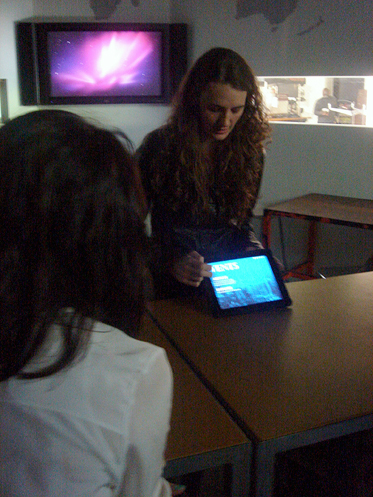
The experimental class—whose test run took place last term and which is being offered again Summer Term—attracted the attention of two education specialists from Apple, one who visited the class and another, according to Barr, who said there was no other class he knew of focusing on editorial for the iPad.
We recently chatted with iPad Editorial instructor Barr and two students who took the class, Graphic Design majors Megan Potter (who graduated last month) and Jinsub Shin about their experience and digital publications.
Carla Barr, Instructor
Dotted Line: Who took this class?
Carla Barr: Surprisingly, everybody in the class was part of the graphics print area of emphasis. They were sixth, seventh and eighth term students whose last interactive class had been early in their Art Center education.
Dotted Line: What kind of work did they do in class?
Barr: They created their own magazines and newspapers. I wanted them to come up with the content, rather than give them an assignment. So they came back with concepts and I had them cover the walls during the second week with their ideas.
Dotted Line: Each student created a magazine?
Barr: A sample of a magazine. They had to create a minimum of three articles, a table of contents, a cover and two covers for future issues. And there had to be interactivity and motion in each story. This was also an editorial class, so I taught them the structure of a publication, use of typography, imagery and sequencing.
Although the content would end up on an iPad, I still had to make sure they understood the fundamentals and everything my editorial students from the past would have to learn.
Dotted Line: How did the students create these publications?
Barr: The class is not a coding class, it’s a concept class. So the students built their magazines on their computers using InDesign. And they did prototypes using After Effects and Keynote. For future students, there will be e-publishing programs coming out very soon from Adobe, hopefully for next term.
Dotted Line: Major publishers are only now starting to get their feet wet with publishing for the iPad. When the class started, had The Daily even come out?
Barr: No, it came out during the class, as did Elle and several other publications. Even the New York Times app changed during the course of the class. We looked at the new apps in class as they came out and we analyzed them. And not just for the way they looked, but also for how the navigation worked, or didn’t work.
Dotted Line: What’s the most unexpected thing that happened in this class?
Barr: The speed with which the students have embraced all the technology that’s been developed and released during the term. Everything is coming out so fast. I kept telling my students that we’re pioneers and that we have to be patient with ourselves. It’s been a really wonderful experience this first term.
Megan Potter, Graphic Design ’11
Dotted Line: Did you have an iPad prior to the class?
Megan Potter: No, I had never even touched an iPad except for once in the student store when I played “Rock Band” for a few minutes. But I have an iPod Touch, so it’s not a completely foreign device.
Dotted Line: As a designer, what’s the difference between designing for an iPod Touch versus the iPad?
Potter: The size. You have so much more space to design with on the iPad, so that gives you a lot more control. The iPad is also more useable for the older generation. My grandma actually has an iPad—she had one before I did! She reads papers and magazines on it. So it’s changing the way we look at these devices.
Dotted Line: What kind of publication did you put together?
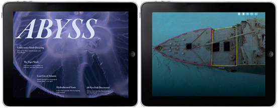
Potter: I made a magazine called Abyss about the deep Atlantic. I’ve always had an affinity for odd things, and what’s odder than the bottom of the Atlantic? There are discoveries being made all the time in the Atlantic, and I thought there should be a publication that notifies the public of those discoveries.
Dotted Line: What kind of stories did you create for Abyss?
Potter: The Titanic is decaying faster than expected and there’s a debate going on right now on whether or not they should bring the artifacts to the surface. So one of my stories explored what we know about the Titanic’s different rooms and the people who were on board. Another article looked at hydrothermal vents, which are little underwater volcano-like fissures that tiny creatures use to travel. And the third feature explored sea life of the deep Atlantic and some of the newer creatures that have been discovered down there.
Dotted Line: You created some fun ways to interact with that last feature.
Potter: While you’re reading the article, little creatures swim up to you and you can learn more about them when you tap on them. For the presentation, I used a moon jellyfish as an example. By tapping on the jellyfish, you place it in your “play section” aquarium, where you can read more about it, see how it moves and play with its tentacles.
Dotted Line: You also had some clever ways of depicting depth in your stories.
Potter: As you read the article, visually you scroll down. As you scroll down, you begin in the water we’re familiar with, and then as you scroll further down you go into deeper waters. At the top of the story there were dots you could tap to visually see something from above the surface that would compare to how deep you in the water. When you click on the Empire State Building, you’re not even halfway down to the Titanic.
Jinsub Shin, Sixth Term Graphic Design
Dotted Line: Did you have an iPad before the class?
Jinsub Shin: No. Before taking the class, I though the iPad was just a huge version of the iPod Touch. I had a few chances to play with the iPad because some of my friends have them, and I didn’t think it was that interesting in terms of its function. But playing with the iPad and making an app for an iPad is totally different. Working on the magazine, there were too many things to think about!
Dotted Line: Tell us a bit about your magazine.
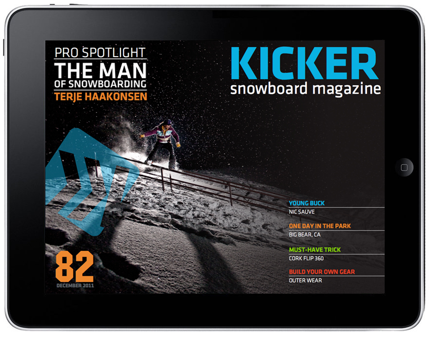
Shin: It’s called Kicker. A kicker is a basic structure for jumping in snowboarding. I’ve been snowboarding for the last 10 years, but I don’t like most snowboarding magazines where you just read an article, look at a few pictures and that’s it. That’s not enough. I want real-time information and feedback on snowboarding areas.
Dotted Line: So Kicker knows your location?
Shin: In the section of the magazine called “Spotcheck,” you pick your snowboarding destination and you get real-time information. You get a map, directions, weather conditions, road conditions and information on how many slopes are open and how many lifts they have. You can check to see which of your friends are there. It connects with Twitter and Foursquare.
Dotted Line: What kind of feedback did you get on your magazine?
Shin: With my magazine, there are many possibilities. Everybody kept throwing out new ideas like adding more videos or adding audio. And, hey, everybody likes music! Snowboarders especially love hardcore and punkcore music. So I gathered all their suggestions and ideas and most of them ended up being reflected in the app.
Dotted Line: Was it helpful to have the Apple representative come to the class?
Shin: Yes, we met him twice. The first time he gave a lecture about the basic ideas behind the iPad and what kind of applications we can use as designers. The second time he visited, he showed us how the iPad functions and offered us some technical advice for our projects.
Dotted Line: Did you face any particular challenges in making your app?
Shin: We didn’t have an application for building apps, so we used Keynote, InDesign, Illustrator and After Effects. Developers have certain tools to put their apps on an iPad, but for people like us, working on the concepts and designs, there aren’t really any tools specifically for the iPad. We need something that functions like Fireworks for the Web, except for the iPad. If Apple could make an application like that, this class is going to get awesome.


Pingback: From a Block to a Tablet « Dotted Line | Official Blog of Art Center College of Design | Pasadena, CA | Learn to Create. Influence Change.
Pingback: What’s Next for Screen Design | Wendy Willard
This class sounds outstanding. I have always wanted to see the merge between editorial and design. Potter takes it to the next power. She sounds like the quintessential AC teacher. Way to go, girl!
-Pam Ward, Art Center Mentor
check that out. I was in interactive design 1 last term with La mer Walker and the final project was to design a functional iPad magazine. Functional through HTML 5 and CSS 3 in Safari, or through an interactive PDF. La Mer also told us about the Digital Publishing Suite that Adobe was working on. I dug pretty deep into that, and saw the amazing things it could do. I wanted my magazine up and running quickly, and i didn’t want to waste time on coding. it never was my favorite part. i emailed adobe and told them i wanted to design a student inspiration magazine for my school and that I wanted to release it on the apple store. next thing i know, i’m on their pre release program with all the advanced tool to design an interactive iPad Magazine, And, build a viewer for it. I enjoyed working with my film peer, Stefan Pavlovic, to shoot the video interview about art center. it’s all about mixing mediums in one place. and there’s certainly more i want to explore with it. redefining editorial experiences, by taking you places, not just showing you pictures or writing about them. meeting people through videos, not interviews, listening to music, including a live twitter feed, etc. here’s the video demo. comments and thoughts are more than welcome. http://bit.ly/lNeZWB