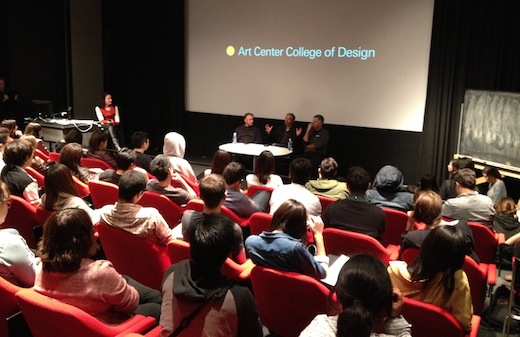
Students packed an overflowing Los Angeles Times auditorium last night for 3×3*: Type Guys, an event that featured three presentations and a lively Q&A with designers Jeremy Mende, Kyle Cooper and Art Center’s own Simon Johnston—three men that have crafted the way we see, understand and interact with typography.
You can read highlights from Johnston’s and Mende’s presentations; today, we’ll focus on Cooper.
The founder of Prologue Films, Cooper has been credited by Details magazine as “almost single-handedly revitalizing the main title sequence as an art form.”
The designer behind the title sequences for films like Se7en, Mission: Impossible – Ghost Protocol and the critically acclaimed current release Argo shared with the crowd his process, his philosophy and some behind-the-scenes tidbits.
Cooper on processing fear:
“I have a lot of anxiety, I have a lot of fear, and I have a lot of anger sometimes. My head does this process every day where it says ‘Okay, what are you going to be afraid of now?’”
“People ask me to do scary things. And I try to scare myself. I try to do something that will scare me.”
Below: Coopers’ title sequence to FX’s American Horror Story.
On bringing order to chaos:
“There’s so much information. There are so many images. I like to do all the research … but then I keep editing down so that I have one controllable thing. I can’t control everything that goes on in the world, but I can control what I’m editing.”
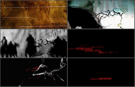
Going lo-fi for director Zack Snyder’s FILM 89 Dawn of the Dead:
“I wanted to do something with the type bleeding. They said, ‘That’s a very complicated fluid dynamic CG thing’ but I thought there must be a way to do it practically. So I printed the pages out on the Kodak printer, turned them on their side, sprayed it with acetone and then shot it with a camera I had. [The titles were] supposed to show chaos all over the world, so it was okay to have messy, low resolution imagery.”
On the freedom of going retro in Argo:
“With film you can do period pieces and not necessarily have to be cutting edge. You can do a movie about the ’70s and people won’t judge it as harshly as they might print, music videos or commercials.”
“I’m always trying to create content and I love it when a filmmaker will involve me beyond just doing a title sequence. [With Argo] I researched the older Warner Bros. logo and tried to do something that could be done with the limitations of the technology that existed during that time period.”
Going beyond the title sequence in Argo:
“I like the idea of designers being storytellers. [The opening of Argo] is not really a title sequence, it’s a prologue. Often a studio will screen a movie and realize that something’s missing. [Director] Ben Affleck knew he wanted to do this all along to set up the story he was going to tell.”
A movie within a movie with a movie:
“The challenge [with Argo] was we couldn’t recreate for a title sequence all these things that really happened. And there were things that would have been very difficult to find stock photography of. And since the movie is about a fake movie–[the characters] pretend to make a movie in order to take the hostages out–I thought it would be interesting to have storyboards depicting the real events. There was something ironic about having the storyboards.”
*3×3: Each term the Graphic Design Department hosts three local professionals to speak on a particular topic.


Pingback: Designer Jeremy Mende on ‘anxious futurism,’ petroleum, biorhthymic data « Dotted Line | Official Blog of Art Center College of Design | Pasadena, CA | Learn to Create. Influence Change.
Pingback: Designer Simon Johnston on Factory Records, Q-Tips lawyers, and self-destructing magazines « Dotted Line | Official Blog of Art Center College of Design | Pasadena, CA | Learn to Create. Influence Change.