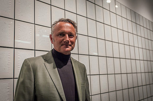
Simon Johnston with his work "Investigation" at the "PAGES" exhibition opening. Photo: Chuck Spangler
Students recently packed an overflowing Los Angeles Times auditorium for 3×3*: Type Guys, an event that featured three presentations and a lively Q&A with three individuals that have crafted the way we see, understand and interact with typography.
Previously we shared highlights Kyle Cooper‘s and Jeremy Mende‘s presentations. Today we focus on Art Center’s own Simon Johnston.
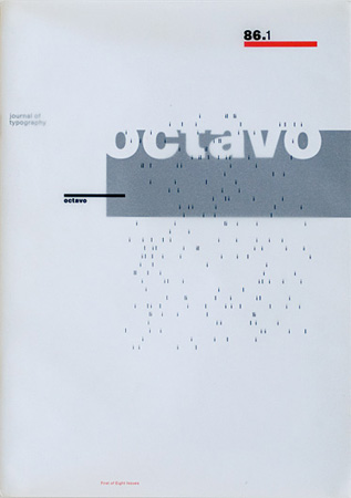
Johnston was educated at Bath Academy of Art in England and the Kunstgewerbeschule, Basel, Switzerland. In England he founded the design practice 8vo, as well as the influential typographic journal Octavo. Since relocating to Los Angeles in 1989, he has run his own design office, Simon Johnston Design, with a particular emphasis on typography, especially book and catalog work for museums and galleries.
Johnston has taught typography and design at Art Center for 20 years. He is currently faculty director of the print area of emphasis in the Graphic Design department. In addition to his teaching and design practice, he works on his own art and photography projects.
At the event, Johnston touched on a variety of topics, including the importance of typography, working with some of his idols and the minefield of registered trademarks.
Here are just a few of the highlights:
On typography:
There’s an old joke: It’s the scene of an accident, a crowd is gathered around an injured person, and from the back of the crowd a voice is heard, “Let me through! I’m a typographer!” Typography may not be a matter of life and death, but as visible language, it is the key means through which we communicate as a society, and as such it’s the spine that runs through the body of graphic design practice.
On his early work:
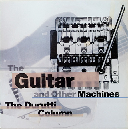
I initially had a job at Conran Associates [in London]. After four months I found out the secretary was getting paid more than the designers. So I quit and a couple of colleagues of mine formed a design studio [8vo]. We were fortunate enough to get work from Factory Records and we did a lot of work for the band The Durutti Column. We were very privileged to have the very best clients you can have—they never wanted to see anything. Complete and utter trust. Once you got the job, that was it. You did the job and sent it to the printer. End of story. No approval process, nothing. That amount of creative freedom was terrific.
On creating the magazine Octavo:
It’s hard for you [students] to understand this, but in 1986 there were very few magazines about design and typography in England. [Octavo] came out of a desire to create a forum for discussion of matters to do with typography and design and art.
[Octavo] was a series of eight issues only. It was designed to self destruct after eight. Though there were some good magazines at the time like Eye and a few others, what tended to happen is there would be a period where [the magazines] were really good and then they would struggle for relevant articles after a while. They’d [start running] articles on Icelandic matchboxes of the 15th Century and lose their momentum.
On working with Ed Ruscha:
A lot of work I do is in close collaboration with curators and artists and I’ve been very fortunate to work with Ed Ruscha on a couple of catalogs. He’s been one of my heroes for a long time. He may be one of the reasons I came to L.A. in the first place. It’s been a great honor to work on some materials with him.
On designing the Whitney Museum’s exhibition catalog for Ruscha’s Cotton Puffs, Q-Tips, Smoke and Mirrors: The Drawings of Ed Ruscha:
I just put that title on the front [cover] because you get the full sense of the poetry. That was how Ed Rusha described his own work to the interviewer, Margit Rowwell.
In the process of doing this, a lawyer from Q-Tips got in touch with us and said, “You can’t use that word in the title.” The Whitney show had already been planned. We’d designed the book. We had to squeal on the brakes. The lawyers said we could only do it if we put a registered mark by “Q-Tips” on the front and on the back [include]: “Q-Tips is a registered trademark of Cheesebrough-Ponds, Inc.” That’s how we had to do it otherwise everything would have had to be cancelled. I justify it now by saying that the [registered mark] “R” by “Q-Tips” stands for Ruscha. Everything’s fine and we meant it all along.”
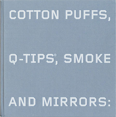
The Whitney Museum's exhibition catalog for "Cotton Puffs, Q-Tips, Smoke and Mirrors: The Drawings of Ed Ruscha," designed by Johnston.
On Investigation, a personal work which can be seen currently in PAGES at the Williamson Gallery:
As a designer, in order to be a good typographer, you have to be interested in language. You have to be interested in the operations of language and how it functions.
Investigation is 256 pages, made from two copies of [philosopher] Ludwig Wittgenstein’s Philosophical Investigations, which itself is an analysis of language. In that book, the author used the word “this” a lot when talking about how certain aspects of language function. [For me] it became almost the secret subtext of the book. So, [Investigation] is every single word in [Philosophical Investigations] deleted except for the word “this.”
Most language refers to something outside itself. The word “dog” refers to a hairy quadriped. With this particular word ["this"], it doesn’t refer to anything outside itself. So in semiotic terms, the signifier collapes into the signified. They become one and the same thing and it’s like a Black Hole of language.
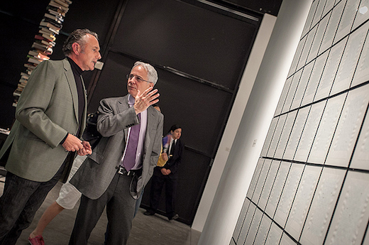
Johnston and Art Center President Lorne Buchman discuss his "Investigation" at the recent opening reception for "PAGES" at the Williamson Gallery. Photo: Chuck Spangler
*3×3: Each term the Graphic Design Department hosts three local professionals to speak on a particular topic.



Pingback: Graphic Design student wins Adobe Design Achievement Award « Dotted Line | Official Blog of Art Center College of Design | Pasadena, CA | Learn to Create. Influence Change.