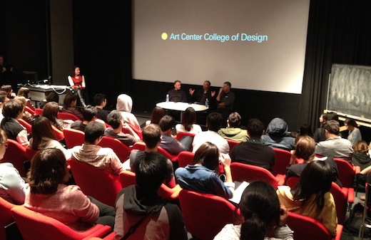
Students packed an overflowing Los Angeles Times auditorium last Thursday night for 3×3*: Type Guys, an event that featured three presentations and a lively Q&A with designers Jeremy Mende, Kyle Cooper and Art Center’s own Simon Johnston—three men that have crafted the way we see, understand and interact with typography.
Last week we gave you highlights from Kyle Cooper’s presentation. Today we focus on San Francisco-based Jeremy Mende, an associate professor of design at the California College of the Arts, where he teaches experiemental typography and critical theory.
In 2000, he founded MendeDesign, a firm that describes itself as creating “unique, poetic and unexpected messages” and that believes that beauty and authenticity have a “critical role in producing things of value and durability.”
Mende has been recognized internationally for his work and has pieces in several collections including at SFMOMA. In 2010-11, he was the Rome Prize Fellow in Design at the American Academy in Rome.
At Art Center, he spoke with students about work he’s created that meet at the “interesection of [his] interest in psychology and [his] interest in design and [his] interest in typography.”
Work which the students appreciated, particularly those who have had a chance to see how the designer’s career has evolved over the last few years.
“What an honest and incredible transformation from his last talk two years ago [at Art Center],” said seventh term Graphic Design student Vina Rostomyan. ”I couldn’t imagine that one could go through such fundamental changes in such a short time.”
Here are some highlights from his presentation:
On designers having power:
“If I have power, what am I doing with it? What am I saying with it? What really is my message as a designer making things that go out into the world?”
On using that power:
“I really like the idea that words have a power to communicate directly to people and ultimately get us to think about our behaviors and how we might change them.”
On the unique paradox of being alive today:
“When any event like [the 2010 Deepwater Horizon oil spill] happens, we’re always confronted with the choice to engage or to ignore it. And that choice, that [feeling] of being trapped between those two places, is something that really defines our time.”
On uncertainty:
“We continually choose between self versus society, indulgence versus sacrifice, engagement versus escape. That inability to reconcile those choices is something that leaves us with a certain amount of anxiety. I came up with the idea of ‘anxious futurism’ to describe that. It’s a palpable awareness of a very uncertain future. That’s something that we’ve gotten oddly used to.”
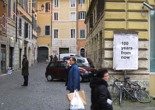
On his 100 Years From Now environmental installation in Rome:
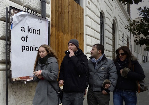
“The way it began was [as an idea] to insert something very simple into the environment. Something that you would see over and over again. [It was] open ended and [provided] as little context as possible. The lack of context forces a decision upon the viewer to either engage or ignore what it’s about. And each exposure reminds you of your previous decision to either engage with it or to ignore it.”
On getting people’s attention:
“It was important for me to make [100 Years from Now] a physical confrontation. I wanted to get in your way when you walk down the street. I think digital media makes it very easy for us to choose the channel we pay attention to and what we want to ignore. This was something that was very hard to ignore.”
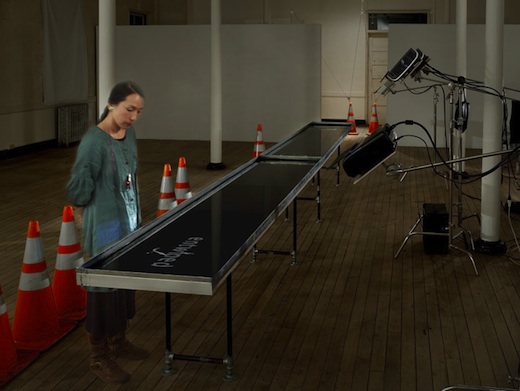
On the question that sparked Narcissus, his recent installation that transformed viewers’ heartrates into words and then projects those words onto a reflecting pool of petroleum:
“It occurred to me that human consciousness is very much about ‘the now.’ What’s in front of it right now. That led me to think about, how would you create something that has lasting effects beyond the initial exposure to whatever the message is?”
On natural bitumen, which figures prominently in Narcissus:
“It’s an organic byproduct of the geologic activity of petroleum in the earth. I liked it because it’s natural, it’s petroleum, and as a symbol, it’s powerful. Oil equals cheap energy, which equals the privelaged lifestyle we’re all very much accustomed to. It also shares properties with us. It’s carbon based; we’re carbon based. It fuels our world and it also poisons our world. That circularity is something I found quite powerful.”
On using biorhythmic data:
“The heartrate is both a trace of your physical presence—it proves that you’re living—and at the same time it’s a symbol for the soul and mortality.”
On creating a personal experience:
“The idea is that it’s an installation meant for one person at a time. It links the user directly to the creation. It’s a frustrated co-creation of a text-based animation experience.”
On reactions to Narcissus:
People found it really disturbing. Hearing your heartbeat already makes people nervous. And then they were disarmed. Everybody read it like an oracle. ‘How does this know this about me? How does it send these messages to me that have this personal meaning?’ And of course it can’t know anything about them, it’s just reading that signal and interacting with a database. But it created a very rich, meaningful experience for people in which they felt directly involved in the production of the message.”


Pingback: Designer Simon Johnston on Factory Records, Q-Tips lawyers, and self-destructing magazines « Dotted Line | Official Blog of Art Center College of Design | Pasadena, CA | Learn to Create. Influence Change.