Graphic Design student, Oliver Lo, created the following rebranding campaign for Hawaiian Airlines as part of a class project. When he posted his materials on Behance, the digital crowd went wild for this casually elegant design, evocative of the tropics without relying on dated island tropes (think: Hawaiian Tropic‘s burnt orange and bikinis). Here, Oliver kicks off a series of posts in which Art Center students unveil the creative process and ideas animating their work.
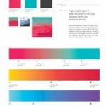
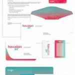
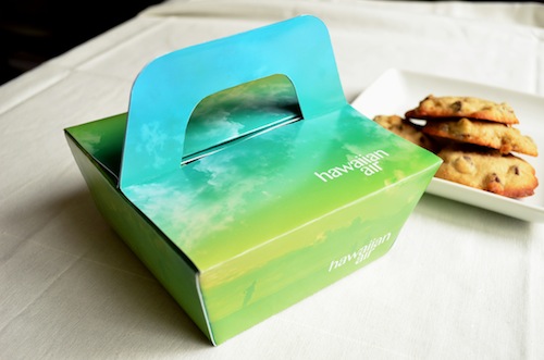
With this rebrand, Hawaiian Airlines establishes itself as a destination carrier that elevates leisure travel to an experience of sophistication, hospitality, premium quality and fun. To reflect this transformation, the airline shortens its name and condenses its logo into a simple wordmark.
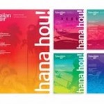
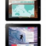
Humanist sans serif typefaces and lowercase letters give the identity a sophisticated and progressive look while allowing it to remain relaxed and approachable. Energetic colors and vibrant gradients–inspired by sunsets, landscapes and flowers of Hawaii–reinterpret the brand and the destination in an unexpected and striking way, while also reinforcing the company’s connection to Hawaii. The brand experience is extended to the website and mobile app where users encounter a rich, immersive interface for trip planning and inspiring travel to Hawaii.